Crypto Wallet App Development: Features,...
April 14, 2025
By Vishal Shah
July 6, 2020/43,541
This blog talks about the main app design ingredients, and how to create a beautiful yet aesthetic app design that is loved by the users everywhere. Visit the blog to know the basic and foremost app design elements that make a great app design.
There has been a common secret sauce to a lot of successful apps, and that secret sauce is great app design. The secret behind any app getting huge success is their app design, user experience, user interface, and everything that is visible to the user on the application. So, follow the best app design practice, and you can lure your users and convert them easily!
In this blog, we will cover the best app design ideas for 2020 and the companies that provide the best app design services.
Let’s see the basic elements of an intuitive, lucrative design that catches the visitor’s attention.
Element #1
Minimal Design
One of the most basic elements of good app design is minimality. The more your design is minimal, the more users will love it. After all who would like to browse the app with a lot of unnecessary design elements on the screen that makes the view complicated.
Look at the following screenshots to get an idea of the minimal app design. The screen should show only the necessary design elements, and clutter out the unnecessary design elements, or shift them to another screen where they are necessary.
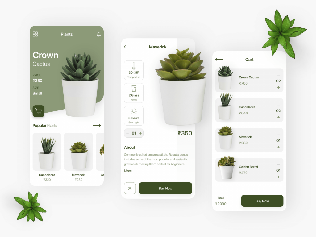
These screenshots suggest that the fewer design elements on the screen, the more users will love it because of the lesser complexity it generates. So, this is how a minimal design can attract users and even convert them.
Element #2
Minimum User Input
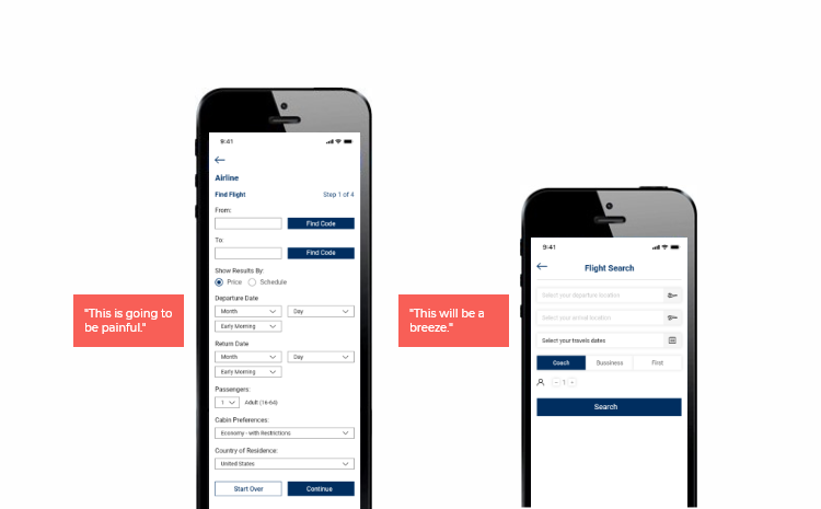
Reduce the user input as much as possible, cause users don’t like to enter information manually, so better keep the user input as less as possible. Imagine you are signing up for some website, and the form wants you to enter your name, email, birthdate, address, age, and everything. You would be canceling the sign-up process, and switch to elsewhere. Keep this in mind while designing any form or app, keep the user input minimum, and the users will love it.
Just observe, which screen you like the most? The left one or the right one?
Element #3
Skeleton Components
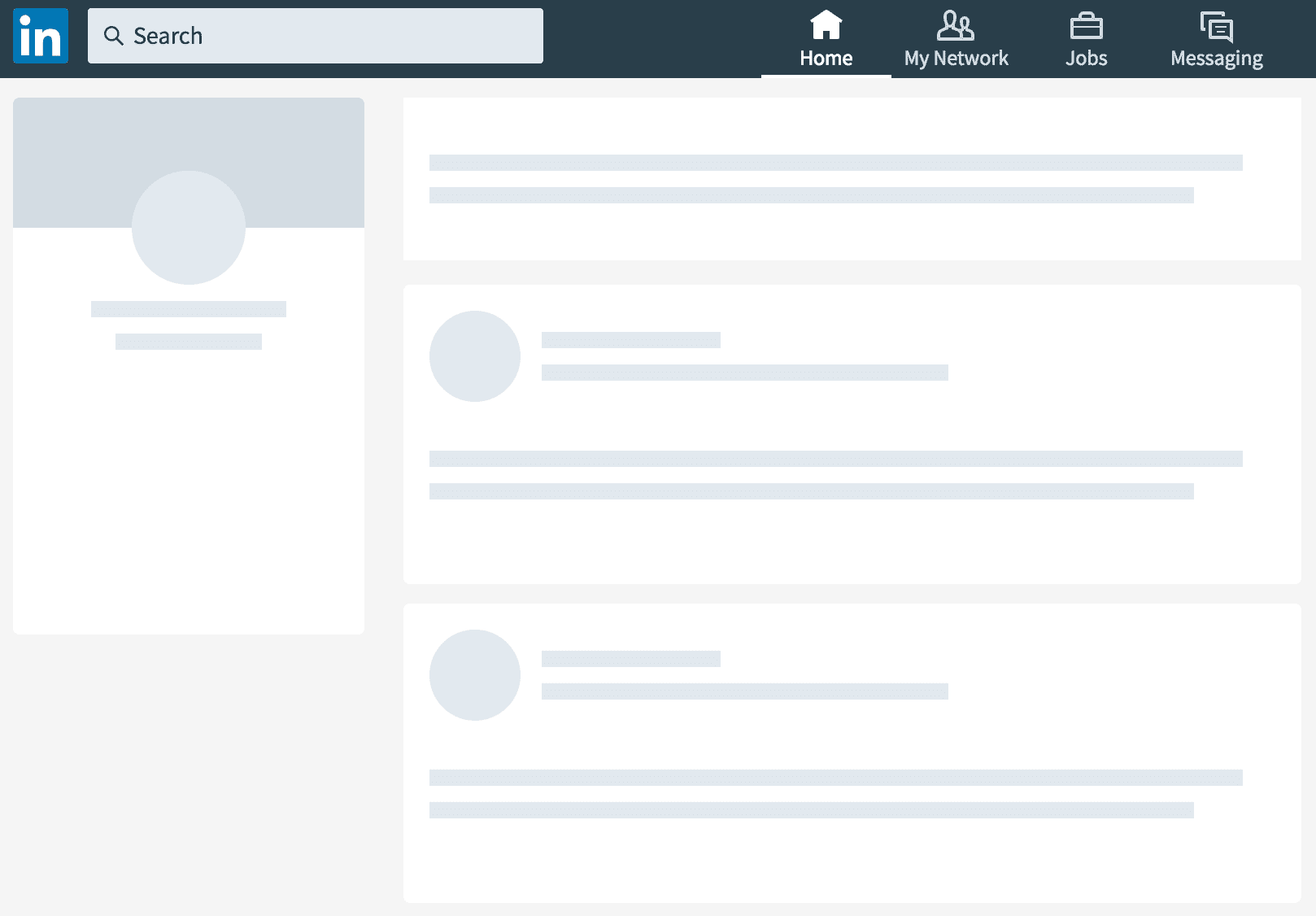
Another important element of a good design is the skeleton components. You can use the skeleton components while the screen content is loading, so the users don’t have to wait until the content loads and appears on the screen. The skeleton should be in such a way that the appearing content and the skeleton should match. You can put a little movement in the skeleton while the content is loading, so it makes the user stick to the screen.
You can put a skeleton component in your app just like the following screenshot:
Element #4
Eye-pleasing Colors
Always use eye-pleasing colors in your application so the users love the view whenever they are on your application. You can use a bright color scheme, light fonts, because this is what the visitors love the most!
You must pick the color as per your app domain. If the app is related to food or such things, then you can use bright orange or red color, if the app is a fitness app then you can use black and white, blue and such colors. You can also use Yellow, Cyan color, Magenta Color, Purple, Orange, and other such bright colors that please the user’s eyes.

Element #5
Easy Navigation
One should design the screen navigation in such a way that the user finds it very easy to navigate from one screen to another. In short, the user should not have any confusion regarding the navigation in your application. Like in the most popular real-time chat app WhatsApp has two main tabs, one is the chats tab and another is the status tab. Users can switch from and to tabs with just one swipe. So, this is an example of easy navigation.
Element #6
Use thumb-zone design
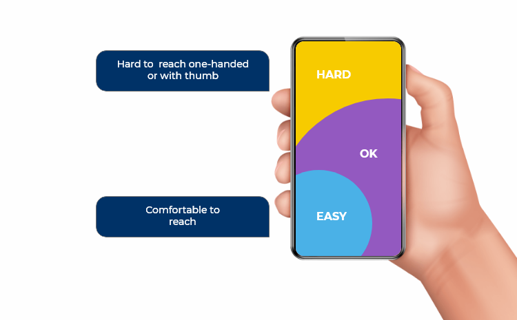
One thing the app designer should consider is that the user should be able to touch on the screen very easily. The necessary buttons or “Add to cart” button or “Checkout” buttons should be in an easily accessible area of the screen. It should not be in hard-to-reach areas of the screen. The user should be able to access your app by the minimum moving of his/her thumb on the screen. Some designers even design apps that are completely accessible by thumbs only, so the navigation requires minimum finger or thumb movement. Such a design adds value to the user experience.
Let’s see an example of an ideal thumb-zone design.
Element #7
Impressive Onboarding Experience
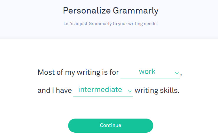
A great design also includes a great and impressive onboarding experience. The user should feel welcome and friendly whenever he/she signs up on your application. You can add great animations, graphic movements, friendly colors, and other such elements that make the user onboarding experience memorable and fun. Remember, “First impression is the last impression”, so make your first impression great by designing a great onboarding experience for your users.
Grammarly has used the best way for an impressive user onboarding. Here, have a look at their onboarding screen.
Element #8
Loading Screen
This is another essential design element that creates a meaningful impact on the user. Whenever your app is loading, and the loading screen is visible to the user, it should be interesting and should keep the user entertained while the app is loading.
Maybe you can put up three dots that keep popping up, or you can show the progress bar depicting the loading progress so the user gets to know how much more time he/she has to wait, or even you can put an interesting character in your loading screen to keep entertaining the user while loading.
Here’s an example of an entertaining loading screen that keeps the user engaged and entertained.
Bonus Tips:
#1 Follow Google’s Material Design Guidelines and Apple’s Human Interface Guidelines.
#2 Keep Visual and Functional Consistency, which means all design elements and functional elements should work similarly across your app.
#3 Use Native Components as much as possible. Do not copy-paste the design elements.
#4 Put up meaningful error messages, so the users know what went wrong. You can’t just display “Some error occurred”.
Final Words:
So after knowing the basic and most important elements that make a good app design, we must be clear on how to create an app design that catches every user’s eyes and also aesthetically great! You can keep visiting this space to explore more about UI/UX designing or to hire the best mobile UI developers.
Inexture has been in the app development domain for the last 5+ years and has designed and developed a lot of successful apps that have made their name in the market. If you have any questions or queries, feel free to ask us or drop an email on sales@inexture.com and we will be more than happy to assist you!
Written by Vishal Shah

